Leaflet research

This blog will analyze professional leaflets used in today’s world, The purpose of this blog is to gain an understanding of different leaflets as well as the content that is put in them, I will be using different references to jot down my research.

A leaflet is a piece of information that can either be recorded on paper or now days can be interactive and shown digitally, as stated by Cambridge Dictionary “piece of paper that gives you information or advertises something” Usually the purpose of leaflets is to inform the reader about a certain subject, for example, fast food joints such as McDonald’s or KFC implement Physical as well as interactive leaflets in order to inform their customers about a new recipe to there order.

KFC Value Menu

KFC Food brochure Melysa Crowl Clayton

Pinterest


ON the topic of food leaflets fast food joints will also tend to promote their establishments through coupons, Personally, I have seen these coupons attached to morning newspapers such as the Metro, these double as leaflets as well as they give the reader information about there products as well as attract them using offers.

Image result for metro newspaper mcdonalds vouchers 2019

My own reference picture of McDonald coupons in Metro Newspapers


App design – Evaluation

Upon completion of my leaflet, I  began working on my app design, For this project, I had to design an app that would showcase and demonstrate the features of my interactive map.

To begin with, I chose to make my leaflet front cover the title of my app. I Did this as at the time I my app theme was different to what it is now, as well as this I thought my leaflet front cover would fit nicely into my app as the audience would recognize the image from my previous task.  Eventually, with time and consideration, I chose to scrap the leaflet front cover as I changed my overall theme and I wanted to be creative and create a new title.

This was the outcome of my final title.

Screen Shot 2018-12-13 at 02.37.09.png


To create this title I used tools such as text, and pen tool to create the illustration shown inside the circle. ONce complete I used shapes to draw and add a circle. Now that I had all my components I use the send to back command the place the circle behind so the illustration was visible. I came up with the name Kingston Grand banquet as I believe it goes well with the overall theme of my project.

Now that My title was complete I continued the process of creating my app. I added various new slides using similar tools mentioned before like shapes and fill color. These were the results of my starting slides.


Screen Shot 2018-12-13 at 02.41.30.png


As you can see I have added the necessary components that you would usually see in an app. I added a login and password section where users can either log in or get straight to the content, As well as this I added my main themes in the selection box, as well as slides showing the result of clicking a certain box. This organized layout I set up enabled me to power through the rest of this task as my thoughts were shown visually on my screen, allowing me to not get confused on the order of slides. To add on to this as you can see I kept my color scheme consistent. I used a color that compliments each other such as blue, grey and white. I think together these colors sit nicely with each other achieving a fun and quirky theme, I didn’t want to overdo the color scheme as I believe that less is more, and in this case, it worked for me.


Moving on to the next part of my ap I decided to design the information boxes. These boxes would contain information on each individual restaurant/ in Kingson that was in my map as well as a screenshot of its location. I decided to add a screenshot as It gives the audience an exact location as well opening and closing time. Screen Shot 2018-12-13 at 02.47.20.png


When it comes to the clouds I added, I felt just adding a screenshot of each shops location was bland and boring. I wanted to add a new quirky feature to my app that represented the theme of it. I decided since I have very light appealing colors that my screenshot locations should be shaped like a cloud. Not only does the blue background compliment this but it also adds another layer to my information boxes making them more visually appealing as well as creative, it showcases my thought process as well as my personality.

To get teach screenshot to be shaped like a cloud I went through the simple process of Drawing a cloud on illustrator, once drawn I used the selection tool to select my chosen screenshot as well as the cloud. Once that was don’t I isolated the screenshot and sent it forward. Since they were now merged together it was a simple process of fitting the map accordingly to the cloud. The final product is what you see above.Screen Shot 2018-12-13 at 02.56.27.pngScreen Shot 2018-12-13 at 02.56.38.pngScreen Shot 2018-12-11 at 09.44.37.png


Now that my app was visually finished it was onto my final step. Getting it to work. This task was very simple as well as not time-consuming. So firstly I went onto prototype. This allows me to link an inmate each slide to my command.  Once on the prototype is was a simple task of me matching up individual links to the chosen slide. For example, to get the user to go back to the menu I Manually set up the links to the symbol representing the bakc button. ONce linked and set up it would direct the user back to the original slide.

Screen Shot 2018-12-13 at 03.01.06.png

I repeated this process for each slide, either making links go one way or the other, I also animated my app to allow users to click certain categories and then be sent to them. An example of this is if a user would click on the train icon in the selection page, the app would direct the user to the information box for Southern rails. This was the end result for my links.Screen Shot 2018-12-11 at 10.54.48.png

as you can see each slide is linked accordingly, Although I did struggle with management and capable organization I got my app to work perfectly And I am happy with the outcome.


To conclude I am happy with the outcome of my app as well as the knowledge I gained from this task. I was able to learn the basics of a software That I hadn’t used before and I will certainly be taking these skills learned on my further studies and beyond.

Interactive app

Kiosk- interactive map

Now onto the final part of my Project, The brief stated that we had to create an interactive kiosk using illustrator to aid this process.

Firstly to begin with I copied and pasted my three favorite slides from Indesign and placed them on my illustrator project. Once placed onto my illustrator, I decided to edit the shape of each box to best fit my Kiosk, To do this I selected the boxes with the selection too And proceeded to click on all the edges. By doing this I was able to curve my boxes and add a sleek and fun design to my kiosk.

Screen Shot 2018-12-12 at 23.41.01.png

Now that I have edited and placed my boxes I moved onto the next step and that was to highlight each box and drag the contents into individual symbols. To do this I selected a box and went to the window tab, ONce on the window tab I clicked symbols and dragged all the contents to the symbol box. I repeated This process 3 times until I had three symbols all containing the contents of the three boxes.Screen Shot 2018-12-13 at 00.05.39.png

Screen Shot 2018-12-13 at 00.10.26.png


On to the actual design of the kiosk now I used the shape tool to create three rectangles, They represented my kiosk. They were currently empty.Screen Shot 2018-12-13 at 00.13.07.png


The reasoning behind using the symbol tool was so I could paste all the contents of my app design boxes into my kiosk.

Moving onto my final step I Selected the three new rectangles that were created and edited their shapes making them 3d. I could attempt this on Maya however I found it easier to do this on Illustrator so I proceeded to edit my squares Here.


To make each rectangle I firstly selected one. Once selected I went on 3d Extrude and bevel, What this does is it allows me to manipulate and input different commands to change the perspective of the rectangle. Heres an image of the tool being used and the effect it had on the shape.

Screen Shot 2018-12-12 at 14.32.00.pngScreen Shot 2018-12-12 at 14.32.58.png

Screen Shot 2018-12-12 at 14.33.34.png


Now each rectangle took on a 3d look and represented a Kiosk more. All that was left for me to do was to paste the contents that I placed on My symbol panel into each kiosk. I made sure to resize them onto the Kiosk before saving it. This was the final result.Screen Shot 2018-12-12 at 15.33.18.png


As you can see I successfully pasted. the contents onto the 3d rectangles. as well as this I included a teal background complimenting my kiosk,. I originally went for grey however I later changed my mind due to its dull atmosphere and effect, I feel the teal nor only compliments the color scheme of my Kiosk but Its also fun and more expressive then grey.


FInlly as an extra side task I decided to find and past Human figures onto my kiosk design. My reasoning behind This was to create A visual representation of how my kiosk would be presented.Screen Shot 2018-12-13 at 00.56.20.png

To conclude I am quite impressed as well as pleased with the final outcome of my kiosk.  i like the color scheme I used as well as the general look of it,  SMall touches such as adding figures for realism, really allows the kiosk to sine, allowing people to see what it would look like in real life scenarios.


Interactive map Leaflet evaluation.

Similar to my map This blog will explain and show the steps and struggles  I took to achieve a finished leaflet for my interactive map project.

Planning

So now that My map was complete I was able to now excel to my leaflet, To begin with, I decided to jot some ideas down in my sketchbook. The reasoning behind this was simple, I wanted to have a physical plan of how my leaflet would feel and look before I began with the final product. As well as this planning out my work shows my work effort and work development towards the project, by showcasing pages of planning, I gain more marks toward my final grade.

Once I completed my brainstorming session I began to design the skeleton of my leaflet. Firstly I drew the layout and measurements of my leaflet splitting the page into three quarters, one being the back, one being the middle and finally the front of the leaflet.  Finally, As my draft was coming together I began filling in the information and illustrations that would be on my leaflet. I began with the front face. For my front cover design, I drew a Wooden door that would cover the whole face. My reasoning behind this design was a pun. I wanted readers to feel like they were opening the door to Kingston, Almost as if they were opening a “leaflet”. So as they open the leaflet the “door” opens and Kingston is revealed.


Practical work.

Now that my draft was complete I decided it was time to start my actual leaflet. I firstly save a file and opened up Adobe Illustrator. With the leaflet template downloaded on illustrator, I began work right away. Starting with the front page I began to digitize the door I created in my book. This was the result.Screen Shot 2018-11-16 at 11.28.17.png

As you can see this image shows an unfinished drawing. It’s unfinished as I decided to change the door layout last minute, I wanted to add more layers and showdowns t my front cover, to emphasize detail and creativity. This was the final result.


Screen Shot 2018-12-06 at 03.31.19.png

As shown above, I added a shade of black across the top half of the door showing the shadow. I’m an addition to this I added a lighter shade of blue showing the sky. I created the shapes and handles of the door y using the pen tool and duplicate to replicate the size and location accurately. Lastly, I enlarged my stoke to 3 to give it a comic feel. I wanted, my leaflet to look inviting and friendly like a comic.


Moving onto step 2  I began filling in the contents of my leaflet. My middle face contains the blurb of the Leaflets. Within that face, readers were able to write notes or thoughts onto the leaflet. It was more of a last minute decision. I was originally gonna to put a brief synopsis of Kingston, talking about its background and reasoning behind my leaflet, However, I was told that wouldn’t be a great idea as leaflets don’t contain synopsis. I Decided to take the criticism and in the end, added a notes section. I used tools such as the pen tool to make the straight lines, Na then duplicated the lines until they reached the end of my leaflet


Screen Shot 2018-12-06 at 03.31.30.png


Finally onto the last slide That’s where I placed all my information and times of fast food content. For example, I would have places like Tesco or Bentalls,  center and next to them the time that they would be open/closed/ The real challenge I found with this part of the leaflet was space and organization. I Wanted to create a sleek and clean design, nothing too fancy or flashy. To achieve this goal I equally split my information up using appropriate typography and font size, nothing more and nothing less. I added no pictures or drawings, and I didn’t change the background color as I thought white complimented the mood of the leaflet. My leaflet ended up looking like this.


Screen Shot 2018-12-06 at 03.31.36.png


Screen Shot 2018-12-06 at 03.31.52.png


Tho I had a finished design I felt something was off and need improvement, that being the front cover, I thought my current design was dull and random, as well as this it looked unfinished, to rectify this problem I decided to use the title page of my app design for the front cover of my leaflet, as well as having a sleek and playful design it was more polished and in . my opinion looked more professional, The art was done to a specific and detailed standard using vectors in illustrator to aid in the shapes, as well as this it had more attention to detail, this was the final result of my leaflet.

Screen Shot 2019-03-14 at 12.23.59.png

Conclusion To conclude I am very impressed and proud of what I have created. At first `I found it bothersome thinking of an idea to present within my leaflet design however as my thoughts eventually materialized, I found it easier to work and accomplish this goal, I can easily look at my leaflet with a sense of pride and accomplishment and in the end I believe I came up with a very modern and fun design that appeals to all nature of audiences, thus highlighting the friendly nature of Kingston,


interactive map project.

127.0.0.1:8090/adobe%20animate%20project%20(2)%20tarek%20(3).html?7111

(PLEASE NOTE THAT ONCE ON THE MAP IF YOU CLICK ON A INFORMATION BOX TO EXIT IT Y(OU MUST CLICK ON THE FOOD ICONS THAT I PLACED INSIDE THE BOXES)

In this blog, I will showcase and give a detailed step by step explanation of my interactive map. I will highlight points such as planning. information. layers, apps and much more.

Planning.

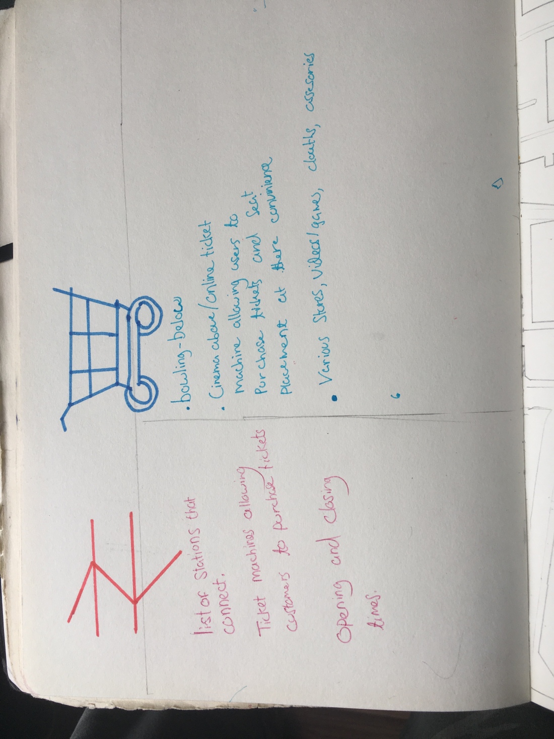
Before I could even attempt creating my interactive map of Kingston I had to first down the groundwork. I new my map was on Kingston so I first decided to brainstorm everything about Kingston. Examples vary from schools to roads, to the cinema. Anything I could think of I would jot down. by doing this I was able to gain a visual representation of what I wanted to do.


After this, I decided to make another mind map now narrowing down a subject for me to add on my map. With much deliberation, I chose to do fast food and human convenience in Kingston.


Now that my ideas were visualized I decided to finally start drawing my map. To my surprise, I was able to come up with the final design fairly quickly. I used google maps as a reference, however adding my own unique twist to Kingston. I only decided to draw a section of Kingston as I believe less is more.IMG_1539.jpgIMG_1538.jpg


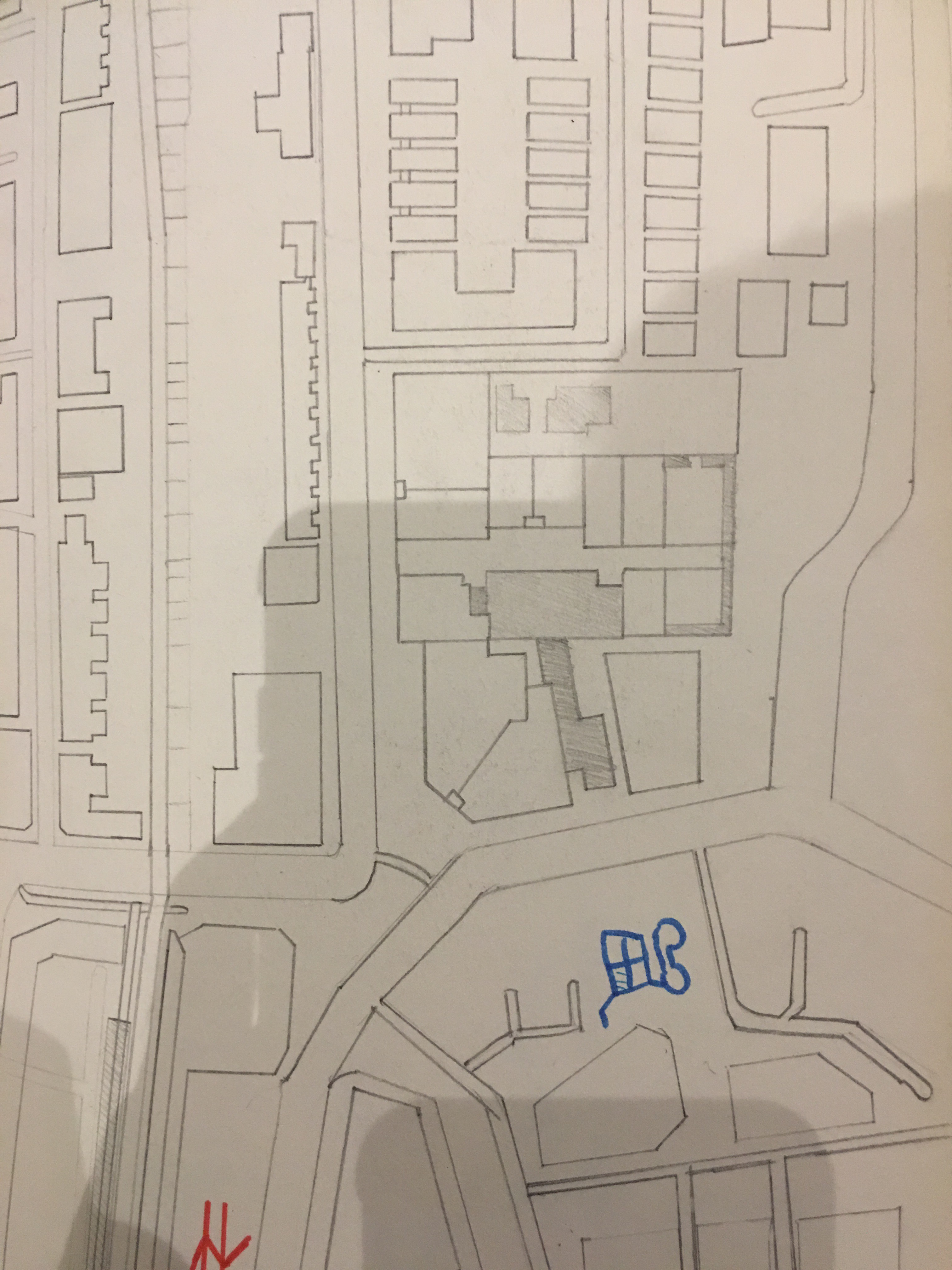
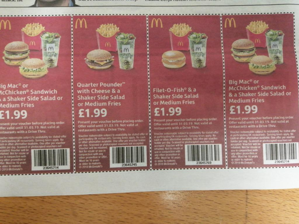
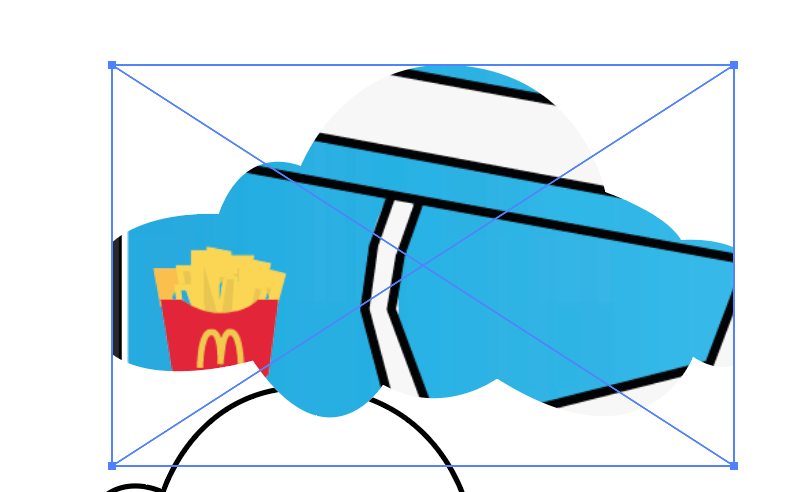
Now I need icons, I sketched and coloured my own icons that I knew would be on my maps. examples such as McDonalds and KFC were drawn on. I also jotted down what each icon would contain information wise.IMG_1540.jpg


Now that I was finally done with planning I moved onto step 2 Practical. 

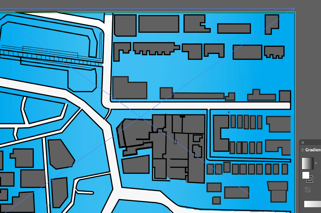
I started off by scanning my map onto illustrator and using the open tools to digitalize and fine tune my map, This was the result.Screen Shot 2018-11-06 at 01.20.51.png


After this step, I decided to add a blue backdrop for color.  Now that my map was done  I decided to add all my other layers including icons and info-boxes. To make my info-boxes I used tools such as the pen tool, fill, text.


Screen Shot 2018-11-06 at 01.22.19.png


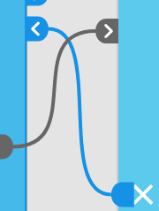
Finally, I was onto my third and final step Animate. I first imported all my work from AI into animate using finder. Once this task was done I began my steps to animate.  I first made all my icons buttons. This enabled me to use them as interactive themes within my map. This process was easier and can be seen on dougs video.  In short, I selected the icon, pressed modify- convert to symbol then isolate and add keyframes on my chosen icon. This allows the icon to become a button in itself making it interactive. I repeated this method for all my icons. In addition to adding to the creativity, I added colours. when the mouse would highlight an icon.Screen Shot 2018-11-06 at 02.04.56.pngScreen Shot 2018-11-06 at 02.06.07.png

Screen Shot 2018-11-06 at 01.23.08.png

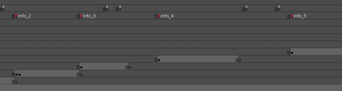
Onto the next step, since i added buttons i needed to link my info-boxes to the allocated icon, Again this process is shown on Doug’s video on Moodle. To archive this goal I went on activity and decided to code all my boxes to the icons. Without the coding, each box would randomly animate on then off the screen with no order or control. By coding the key bindings and naming each I was able to click on an icon thus making the chosen info box appear.

I personally found this process to be quite challenging and long, The coding was very precise and I knew if I had just one spelling mistake the whole code wouldn’t work, luckily I was able to overcome this and eventually produced a final product.


Other smaller processes that I tackled were only minor things such as closing boxes. Unfortunately, I wasn’t able to add sound as I ran out of time and mostly animate wouldn’t allow me to sample an mp3 download.


Conclusion

To conclude I look back on this project being proud of what I have achieved. By all means, this is not my best work and I found time management a real struggle, however, i completed this experience gaining new practical and common skill such as how to use animate, attention to detail, and a sense and importance and attention for deadlines.